
Rolling Steadily Toward Success
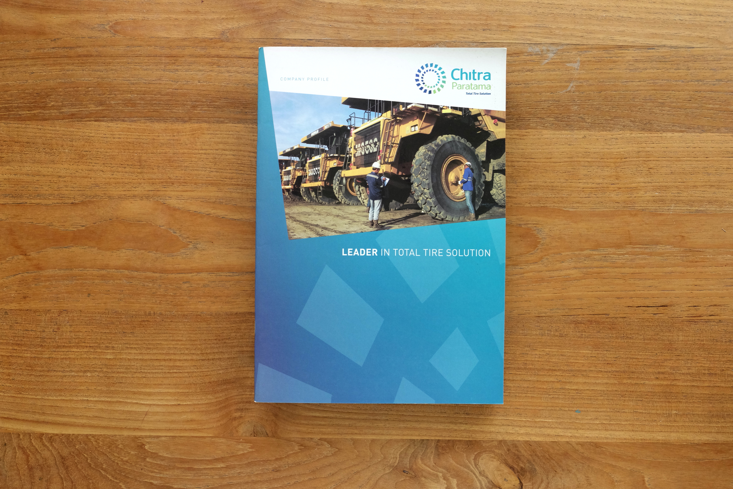
Chitra Paratama, or known as CP, is a tire distribution and services company for Michelin heavy industries products. The company's former logo requires an overhaul, and with it a professional and modern image. By taking the philosophy of tire treads, solid in grip, steady to ride, we literally composed cyclical outer and inner treads as the main symbol, making it radiant in color, with youthful ambience. Because of the treads' unique geometry, the supergraphic element makes sense. The printed profile and website takes advantage of the dynamic visual energy from the rotating treads.
Program
Logo Design, Brand Manual, Business Letters, Corporate and Marketing Collaterals, Printed Corporate Profile, Building Signage, and Website.
Credit
CLIENT
Chitra Paratama / Mahadasha
CREATIVE TEAM
Ismiaji Cahyono, Erlangga Djojosaputro, Charles Lee
Gallery


Graphic design is the forefront of branding.
The corporate image, identity, and communication is made possible through graphic design.